SOCIAL media DATA GETS PHYSICAL
Continuing on from our earlier post on data visualisation as 3D infosculptures, we this week shine the spotlight on similar visual ventures, instead exploring how the data extracted from our social media profiles might be used in more analytical applications.
Data can be extracted from social media platforms and tabulated into tables and graphs easily enough; it can also be translated into pretty impressive infographics, particularly with relation to the immense geographical data available worldwide.
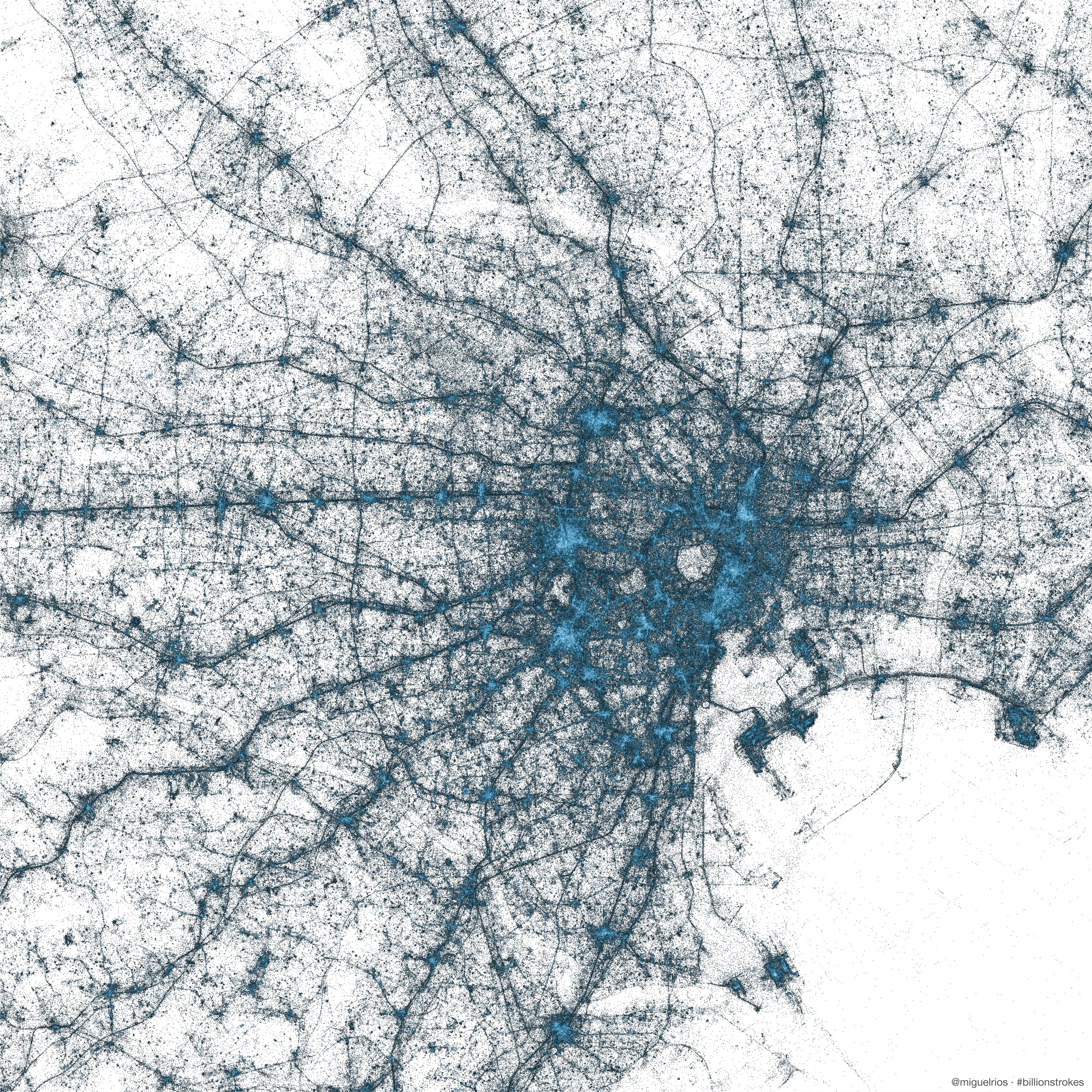
TOKYO The geography of Tweets: This image uses all of the geo-tagged Tweets since 2009 — billions of them. (Every dot is a Tweet, and the color is the Tweet count.)
Source: TwitterHQ
Though, for a medium as interactive as social media, surely a more innovative, imaginative output of analysis is required, if not demanded? Social media is all about the latest and most up-to-date news, trends and information, thus why shouldn’t the method of interpretation be just as up-to-date?
The data available from social media is so immensely broad that analysis of it can – and should – be seen as a blank canvas, open to interpretation from the imaginations of anyone willing to undertake it.
When the capability of 3D printing technology to work with data of a wide variety, whether abstract, or more straightforward, is taken into account, the potential to transform the many types of data available for extraction from social media (i.e. geographic, socio, numerical etc) into 3D visualisations becomes clear.
EXAMPLES
@FRSTEE
First up, the @Frstee project. The idea behind it was to export the account information from participants’ Twitter accounts – i.e. number of followers, length of time of account etc – and transform the collected data into… snowmen.
Frstee The Twitter-Sourced 3D Printed Snowman from INITION on Vimeo.
As the brainchild of RIG London, a Shoreditch design partnership, and Andy Huntingdon, the project offered social media-savvy, festive Twitter users the ability to turn their accounts into handy, personalised Christmas decorations.
The data from each account was used as such: the size of the head of the snowmen was determined by the number of followers the account had, whilst the number of buttons down the snowman’s front indicated the number of years the ‘Twitterer’ had been Tweeting.
To top it off, a unique engraving of each person’s username took pride of place at the base of the snowman.
")
")


FACEBOOK STARS
Inition were approached by SapientNitro to produce novelty, yet thoughtful Christmas gifts for their clients, based on the data from each of their Facebook profiles.
Using a specialised algorithm, Inition created the bespoke 3D printed ornaments, the points of which indicated how many Facebook friends each recipient had in various countries around the world.
Each point represented a different country, with the length of the arm illustrating the number of friends – i.e. the longer the point, the more friends in that particular country.
Accompanying the stars was a fold-out ‘map’ of the basis of the data (the friends) which allowed the recipient to place their star within a more contextual surrounding.


OTHER 3D SOCIAL MEDIA DATA VISUALISATIONS
Monsters, Crystals and Horoscopes: Turning Facebook data into offbeat 3D sculptures
This particular project utilised a series of 3D web apps, developed by The Creators Project in conjunction with VICE, which distilled the Facebook user data of each recipient into either a monster, crystal, or horoscopic ‘Morphogram’ – depending on the particular app used.
MONSTER ME
Monster Me, the app that transformed the data into a monster, relied not on the use of friends’ data, but on various Facebook likes. This particular project also offered the option to extend beyond the monster itself, allowing users to expand into buildings which were based on their profile interests.

Source: Creative Review
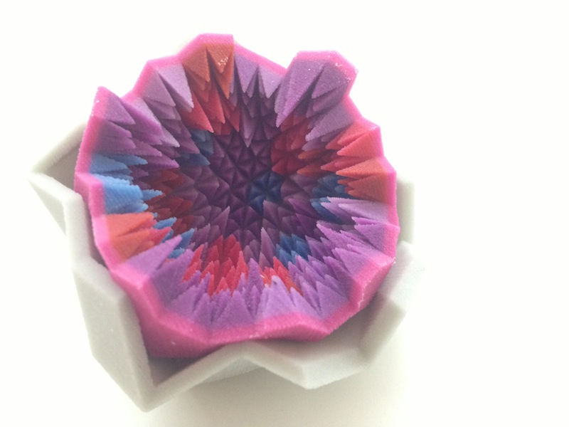
CRYSTALLIZED
The Crystallized web app, much like the SapientNitro Facebook stars project, used Facebook friend data to generate a ‘crystal’ with each point representing a unique friend and the user’s relationship with them.
The inner layer was made up of ‘crystal clusters’ which signified shared interests shared by the participant with their outer-layer friends. The crystal could be customised either by the colour of the interior, or by increasing the number of friends it representing, making the inner layer much more intricate.
Source: Creative Review
Once the crystal was complete, the data could be sent to a 3D printer and turned into a physical object which split in two, revealing the inner design.
ASTROVERB
The last of the three web apps was developed with a more mystical output in mind: Astroverb analysed the texts from user’s posts and, using a specific algorithm, plotted the words along several ‘dialectic rings’, according to how closely related they were to six pre-determined personality traits.
The finished product, or ‘morphogram’ (an angled, geometric shape), was intended to ‘reveal your destiny’ though, once printed, the 3D version could be affixed to a chain and worn as an item of jewelry.
Accompanying the morphogram was a horoscope, which extended the mystical theme, which was formulated as a result of the textual analysis of the user’s posts.
Source: Creative Review
KITCHEN DATA
It’s been said before, but one of the best features of utilising 3D printing technology is its compatibility to work with hugely diverse types of data; whether it’s numbers, words, geographic locations – you name it and it we guarantee we can turn it into an algorithm our 3D printers can work with.
But, if we were to use a cooking analogy (and we will), data is but a mere ingredient and the 3D printer a cooking implement in the grand scheme of the end meal. The real magic – and where the best kinds of data visualisations come from – is the chef. At the end of the day, great data visualisations come down to the ingenuity of the person doing the analysis. After all, data is nothing to begin with – it’s what you make of it that really counts.